

Subscription churn
What makes this report different
While Shopify’s Partner Dashboard doesn’t track churn metrics at all, Mantle gives you a complete picture of your subscription health. We don’t just show you who’s leaving - we help you understand if they’re coming back and what it means for your business.
Report components
Your numbers at a glance
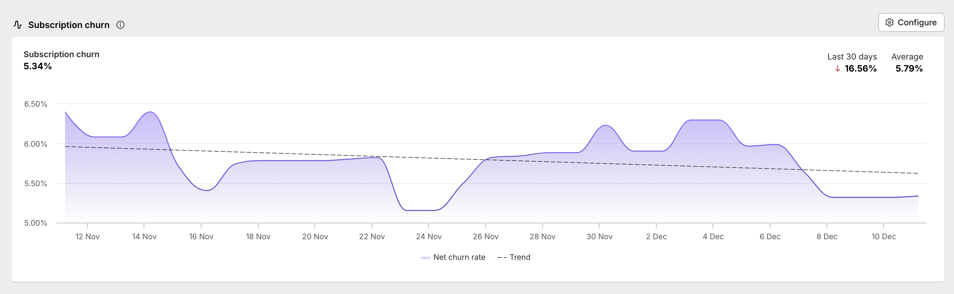
Right at the top, you’ll see three key metrics that tell different parts of your churn story:
Current churn rate - your snapshot of right now
Period change - how your churn has trended over your selected timeframe
Period average - your baseline churn rate across the whole period
These numbers work together to help you separate normal fluctuations from real problems that need attention.
The churn visualization
The main chart shows how your churn rate changes over time:
Purple filled area represents your churn rate
Dotted trend line helps you spot longer-term patterns
Hover tooltips show you exact numbers for any point in time
This visualization makes it easy to spot both sudden spikes that need immediate attention and gradual trends that might need strategic changes.
Understanding your numbers
Churn calculations
You’ve got two ways to look at churn, each telling you something important:
Gross Churn Rate: The percentage of customers who cancelled, period. This helps you understand the total impact of cancellations.
Net Churn Rate: Accounts for customers who come back. If someone cancels but reactivates later, they’re removed from this number, giving you a more accurate picture of actual customer loss.
Reading the patterns
Not all spikes in churn are created equal:
Sudden spikes might indicate immediate issues needing attention
Gradual increases could suggest deeper product or market fit challenges
Seasonal patterns help you plan for natural fluctuations
Trending improvements often show your retention strategies working