Revenue churn
Ever wonder if losing those 10 customers last month really matters? Revenue churn tells you the story that subscription numbers can’t - exactly how much revenue you’re losing and whether those losses are hitting where it hurts. Think of it as the difference between knowing how many customers left and knowing how much their departure actually impacts your bottom line.
What makes this report different
While basic churn metrics just count lost customers, revenue churn shows you the financial impact of those losses. A 5% subscription churn rate might sound scary, but if it only represents 2% of your revenue, that’s a very different story. Similarly, losing just one customer might not seem significant until you realize they represented 10% of your monthly revenue.
Report components
The main visualization
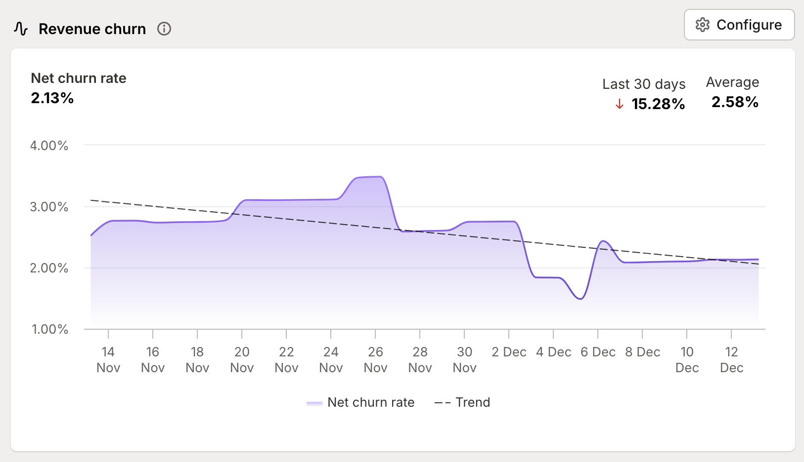
The heart of the report shows your churn patterns over time with two key elements:
A purple line tracking your actual churn rate - showing the real impact of customer movements
A dotted trend line revealing the longer-term direction of your churn - helping you distinguish between temporary spikes and concerning patterns
Key metrics
At the top of the report, you’ll see three crucial numbers:
Current churn rate - your snapshot of right now
Period change - how much your churn has changed over your selected timeframe
Average rate - your typical churn level during this period
Configuration options
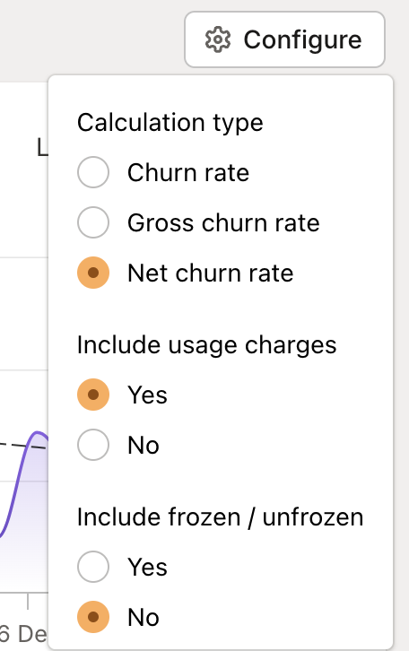
The report gives you precise control over how you measure churn:
Calculation types
Churn rate: Just the pure revenue lost from cancellations
Gross churn rate: Includes both cancellations and downgrades
Net churn rate: The complete picture - cancellations and downgrades balanced against upgrades and reactivations
🔑 Pro tip:
Usage charges are optionally added. When you include usage, we take the livetime average monthly spend and add that to the churned merchant’s subscription value to get their impact on churn.
For example, a customer paying $10/month in subscription fees has $120 total over a lifetime of 12 months. They would be contribute $20 of lost revenue here. Including usage charges in your calculations can reveal the true impact of customer losses.
Understanding your numbers
Beyond basic metrics
Revenue churn isn’t just a single number - it’s a signal that helps different teams spot opportunities and issues:
Customer success: Track retention effectiveness by comparing gross vs net churn rates. High gross churn but lower net churn? Your team is doing great at upgrades and reactivations.
Finance: Use trending data for more accurate forecasting and health assessment
Marketing: Spot quality issues in your acquisition funnel through elevated churn rates
Product: Identify whether specific customer segments or plans show concerning churn patterns
Making sense of movement
When looking at your churn trends, consider:
Sharp spikes vs gradual increases
Seasonal patterns vs unexpected changes
The relationship between subscription and revenue churn
Impact of frozen shops (which can mask true churn patterns)
Making the most of this report
Smart segmentation
Use segments to understand churn patterns across different customer groups:
Track churn by Shopify plan level
Compare retention across acquisition channels
Identify high-risk customer segments
Monitor geographic or industry-specific patterns
Pro tips
Level up your churn analysis with these strategies:
Compare subscription churn against revenue churn to understand the value impact of customer losses
Use time periods strategically to spot seasonal patterns or measure the impact of retention initiatives
Track your frozen shop rate separately to understand involuntary vs voluntary churn
Consider enabling usage charge tracking for a complete picture of revenue impact
Use Journals to mark important changes or initiatives and track their impact on churn rates
Looking to turn these insights into action? Our team is here to help you make sense of your churn patterns and build effective retention strategies.